ANCHOR is a volleyball apparel brand that represents strength, confidence, and dedication. Its bold typography and minimalist design reflect the competitive spirit of volleyball.
Project Overview
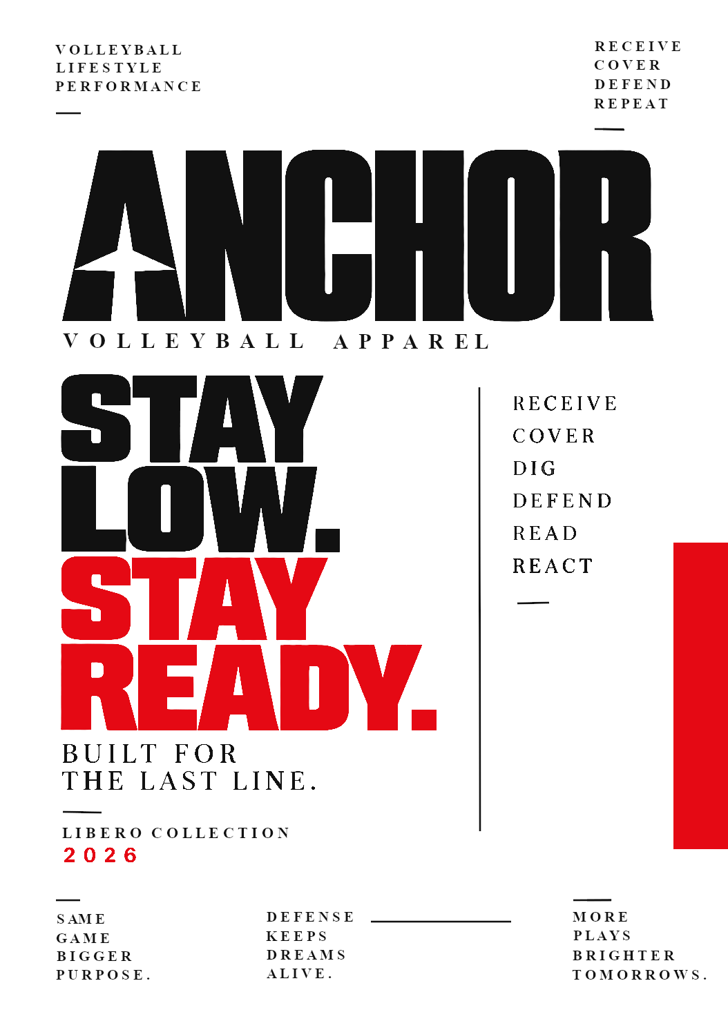
This project focuses on creating a typography-based brand identity poster for ANCHOR, a fictional volleyball apparel brand. The design highlights the brand's identity through bold lettering, strong visual hierarchy, and a black, white, and red color palette.
Design Challenge
Creating a recognizable brand identity using typography alone while maintaining visual impact and clarity.
Approach
Used bold typography, contrasting colors, and organized layouts to create a strong and professional brand identity.
Project Highlights
Bold Typography: Uses heavy fonts to emphasize the brand name and message.
Minimalist Design: Focuses on text and geometric elements.
Color Contrast: Combines black, white, and red for a striking appearance.
Strong Branding: Features the ANCHOR name prominently.
Motivational Slogan: "Stay Low. Stay Ready."
Volleyball Identity: Incorporates volleyball-related terms and defensive concepts.
Brand Message: Promotes strength, readiness, and dedication.
Project Gallery
Final outputs and supporting work from the project.
Final Anchor poster
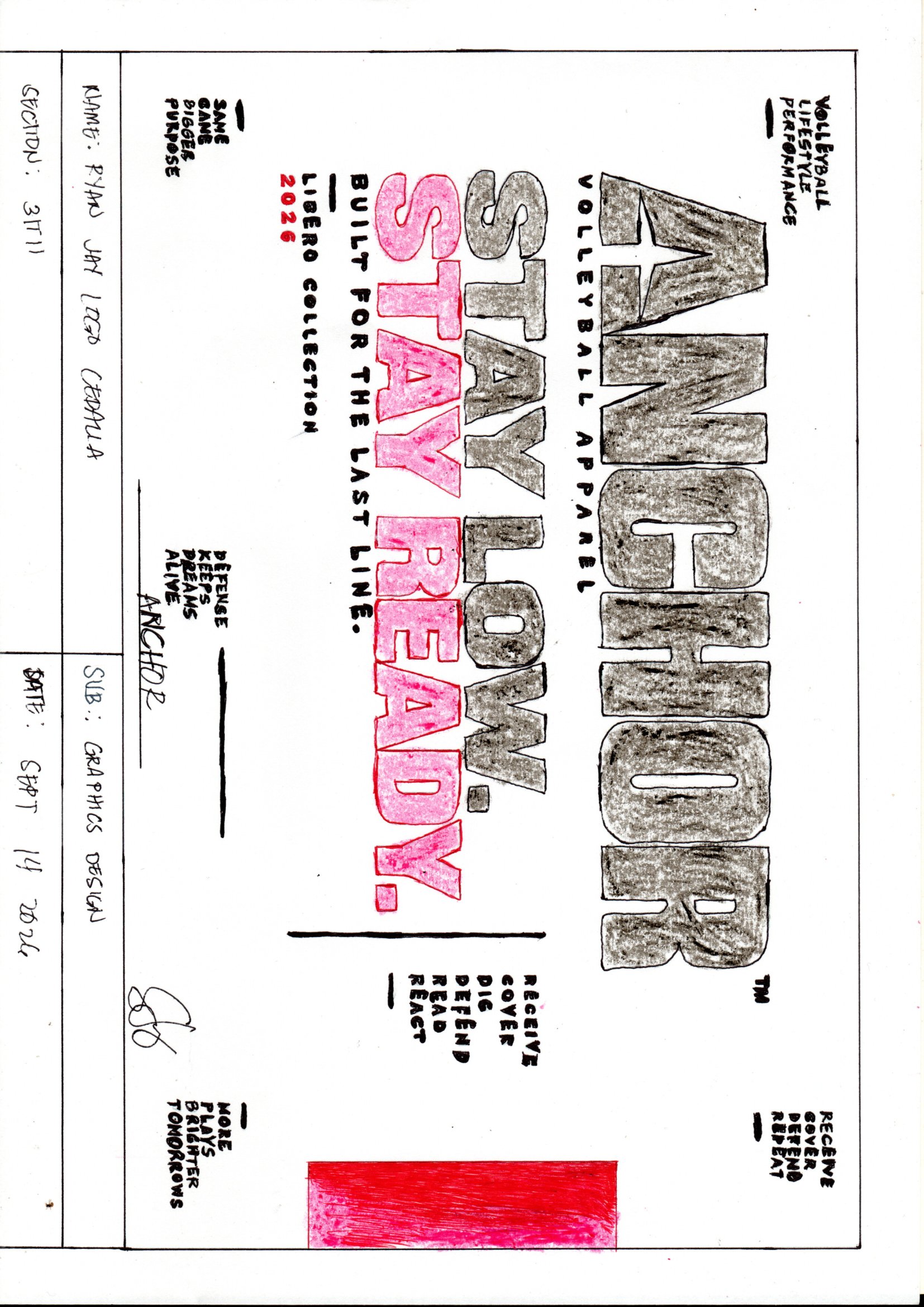
Initial poster sketch
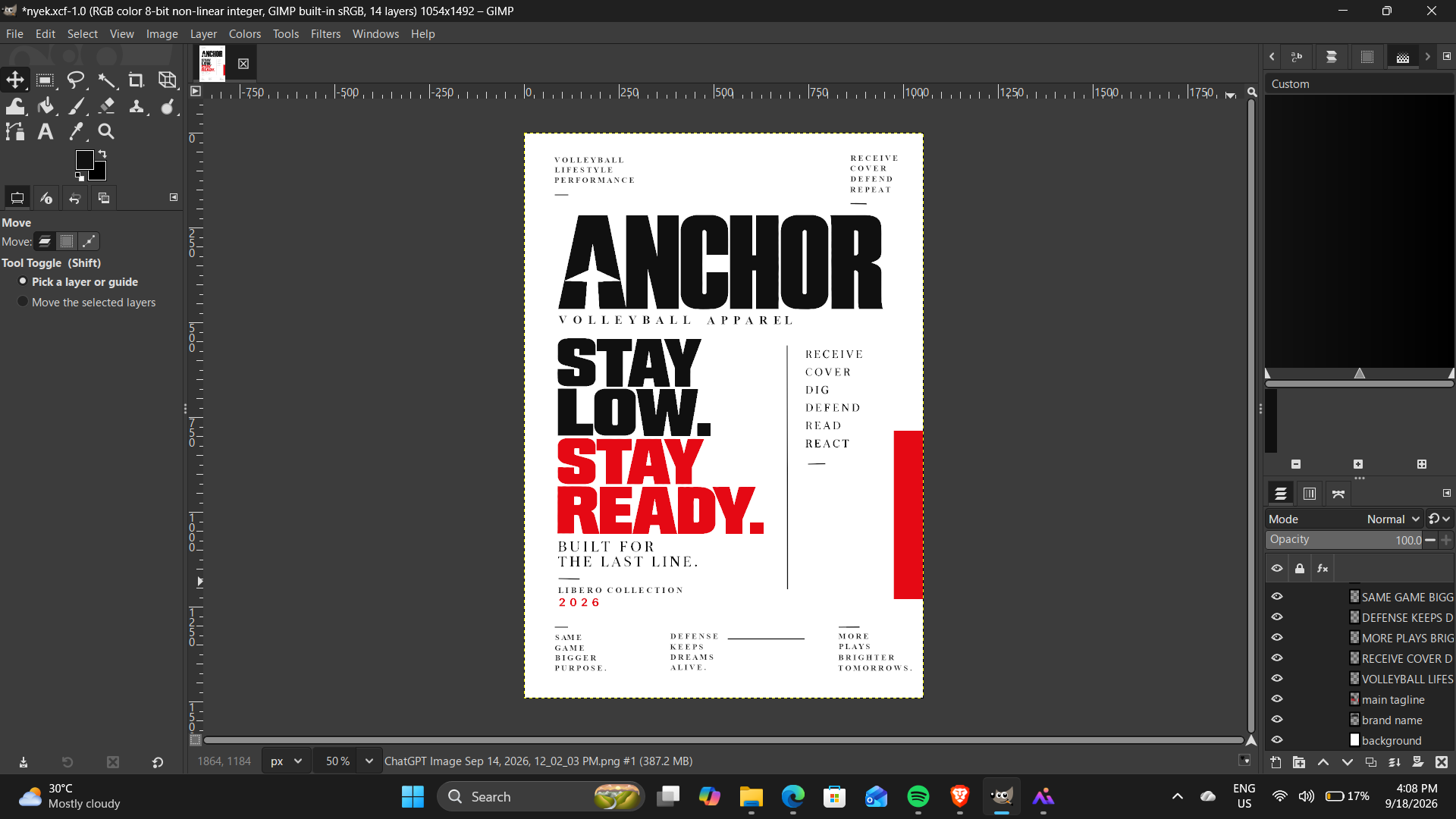
Design workstation view